
News

Words_Hadi Afif
Declaring that this is a text about Arab design, or Arab graphic design, would be disingenuous. Part of that hesitation comes from the fact that the term “Arab” itself is loaded for some and confusing for others. The self-proclaimed free thinkers of the world, or those who subscribe to a puritan, schizoid understanding of identity as blood and ancestry, would very passionately wag a finger at the idea of being associated with an Arab lineage. That alone is a minefield that cannot be navigated in a couple of thousand words.
Another part of that hesitation comes from the image in question itself. Calling it a “graphic image” would already be doing it a disservice, considering graphic design, as an imported discipline, carries an inherently Eurocentric point of view. So, for all intents and purposes, the “image” being discussed here is any designed image emerging from the region designated as the Middle East, SWANA, the Arab world, or whichever term best accommodates the reader’s political sensitivities.
Fortunately, the image itself has never been particularly interested in these distinctions. The graphic image emerging from the Arab world has always been shaped through overlap and exchange. At the moment, on a surface level, it is a visual language formed as much by Islamic ornament and regional vernaculars as it is by migration, colonial modernity, oil economies, pan-Arab broadcast media, pirated software, Tumblr dashboards, bootleg fonts, satellite television graphics, WhatsApp forwards, and Meta-algorithms.
Hence, back to the main low-stakes dilemma being posed: defining the contemporary Arab image feels almost impossible. It is too online to be traditional, too historically dense to be “post-(post)-internet”, and too dismembered to function as a coherent identity project.
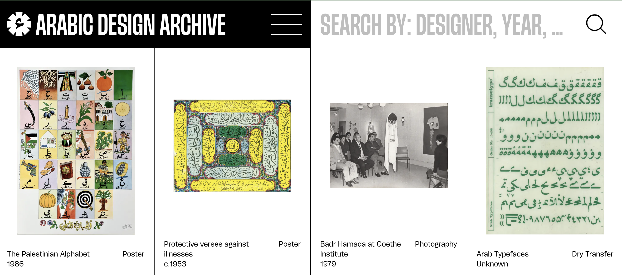
Part of the reason this question has become increasingly possible to even ask is projects like the Arabic Design Archive. Founded in 2020, the archive was created to fill a glaring gap in the literature, primarily the lack of accessible historical documentation around Arab graphic design. Posters, book covers, stamps, packaging, magazines, type specimens, ephemera, visual identities, discarded printed matter – the things that don’t survive the test of time due to institutional neglect and oversight, war, migration, and censorship. It is an open, decentralised, and constantly expanding collection attempting to map the kaleidoscopic history of graphic production across the region, from Cairo to Beirut to Casablanca.
A useful point of departure is A History of Arab Graphic Design (2020) by Bahia Shehab and Haytham Nawar, which offers one of the clearest timelines through which the contemporary Arab image can be understood. In their introduction, the authors sidestep questions of ancestry altogether, instead documenting “the work of designers and institutions in and from the Arabic-speaking world, defined as the twenty-two nations represented in the League of Arab States.” What unites the field at hand is not bloodline or ethnicity, but a shared historical and political experience, and, most importantly, a visual language embedded within Arabic itself.
The first chapter of the book is dedicated almost entirely to unpacking this relationship, tracing the foundations of Arab graphic design back to Islamic visual culture, which emerged through centuries of cultural exchange, drawing from Christian, Byzantine, and Sasanian artistic traditions before developing into a distinct visual system of its own.
Through trade and conquest, this language spread across vast geographies, eventually becoming one of the defining visual frameworks of the region. Arabic calligraphy is paramount to understanding this visual system. Islamic visual culture was built upon geometry, ornamentation, figuration, and script, but calligraphy occupied a uniquely privileged position.
Unlike most writing systems, the Arabic language exceeded the function of communication. Owing to its sacred status as the language of the Qur’an, it evolved into an artistic medium in its own right, appearing across architecture, manuscripts, and everyday objects alike. The script functioned simultaneously as language and image, communication and decoration in one. As the authors note, the balance often shifted “from readability to visibility,” inviting viewers to appreciate the shape of the letter as much as its meaning. The letter itself became a visual object.
Therefore, every contemporary experiment with Arabic typography, knowingly or not, draws from this tradition. Long before graphic design became a named profession, the region had already developed a language where communication and image-making were one and the same. And that is possibly where the clash between graphic design as an imported profession and traditional Arab design begins.
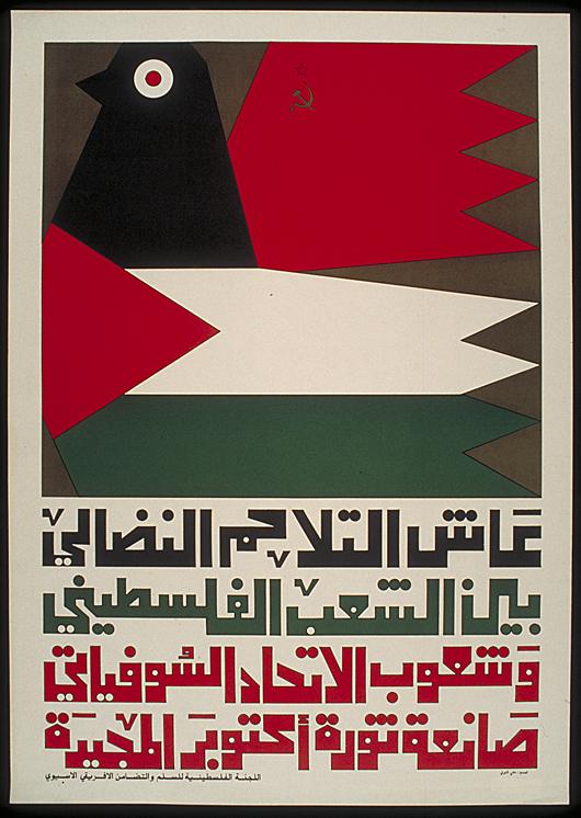
The early decades of the twentieth century were dominated by artists, calligraphers, printers, publishers, and illustrators whose practices frequently overlapped, long before the designer emerged as a discrete professional category. Egypt, owing to its publishing industry, educational institutions, and relative industrial development, became one of the region’s primary visual laboratories. Newspapers, magazines, publishing houses, and Egyptian cinema accelerated demand for visual communication, while independence movements and nation-building projects transformed design into a political and cultural force. By the 1960s and 1970s, graphic design had become inseparable from the region’s political imagination, nowhere more visibly than in the Palestinian resistance poster.
One could argue that the divergence between traditional Arab design and graphic design as we understand it today began in the 1980s, with the emergence of the computer and market liberalisation across the region. The advertising agency, as a communication firm, took root. Multinational brands entered the region carrying their own corrosive foreign visual systems. Design increasingly moved away from the hands of artists, calligraphers, and illustrators into those of agencies. English became the default language of multinational branding and communication, and Arabic was often relegated to a secondary role. When it was used, the demands of mass advertising dulled the Arabic letter’s edges.
To understand what was (and is still largely) lost, it is worth looking at what existed prior. Even the earliest documented examples of modern design feel inseparable from their surroundings.
Phillippe Waked’s Arabic typewriter at the turn of the twentieth century, an invention that attempted to reconcile mechanical reproduction with the fluidity of Arabic script, was revolutionary. These earlier artefacts remain visible in the enduring popularity of Egyptian film posters, from Ragheb Ayad‘s posters for Yahya al-Hubb and Qitar al-Layl to Salah Marei’s poster for Al-Mumya’, to almost any poster featuring “Cinderella of the screen” Souad Hosny, including the iconic artwork for Samir Seif’s Al-Mutawahisha. Egyptian cinema transformed Cairo into a visual laboratory, introducing new ways of illustrating images, composing layouts, and writing Arabic script. These designs were once much closer to the people consuming them, closer to the “street” and local forms of expression.
The convergence of design, education, and cultural production was clearly embodied by the likes of Dar al-Fata al-Arabi, the Beirut-based children’s publishing house founded in the 1970s. Bringing together some of the region’s most influential illustrators, writers, and designers, including Mohieddine al-Labbad and Hilmi al-Touni, and backed in part by the Palestine Liberation Organization (PLO), it viewed children’s literature as a site of imagination, pedagogy, and nation-building. Its books shaped how countless children first encountered illustration, typography, folklore, resistance, and even Arab identity itself. The designed image was a pedagogical tool; a generation was being taught how to see itself.
By the 1980s, the computer had standardised the Arabic letter on one hand, while opening entirely new possibilities on the other. The 1990s and early 2000s saw design move beyond publishing houses, advertising departments, and state institutions into universities and independent cultural spaces. Dedicated graphic design programs were developed across the region, producing a generation of practitioners who approached the discipline critically. At the American University of Beirut, designer Leila Musfy helped establish the graphic design program in 1992, working alongside master calligrapher Samir Sayigh to bring calligraphy back into conversation with contemporary design practice. At the same time, studios such as Karl Bassil‘s Mind the Gap and Kameel Hawa‘s Al Mohtaraf helped build a design infrastructure in post-war Lebanon, while figures like Mamoun Sakkal, Munir al-Sha’rani, and the team at DecoType were grappling with making the Arabic script thrive within digital systems largely designed around Latin typography. Arab design was being both revived and reinvented by a generation equipped with new tools and determination to rethink the Arabic image.
By the 2010s, the language had become the starting point of contemporary design. Nadine Chahine’s typefaces helped integrate Arabic into some of the world’s most widely used font families, while Pascal Zoghbi’s 29LT, founded in 2013, pushed bi-script Arabic-Latin typography to new limits. Through the efforts of these designers and a sea of their peers, the Arabic letter became the central figure of contemporary design, and its most fertile frontier of experimentation.
The past decade and a half has already answered how to make Arabic typography “contemporary.” The last six or so years have seen a younger generation alchemise that foundation with the chaos of the present: gaming and 3D engines, AI slop, low-resolution archives, pixelated religious iconography, and whatever else the internet provides as raw material. The image became increasingly networked, drawing simultaneously from centuries of visual tradition and an endless stream of digital residue. The result was an image mutated into something hyper-referential and overloaded – a reflection of the conditions that produced it: a global pandemic, insidious algorithms, and a dopamine circuit-frying online world. But that is also a reductive take. What is certain, however, is that the democratisation of tools such as Blender and Unreal Engine, coupled with an effectively infinite pool of references, pushed the Arab image into new territories.
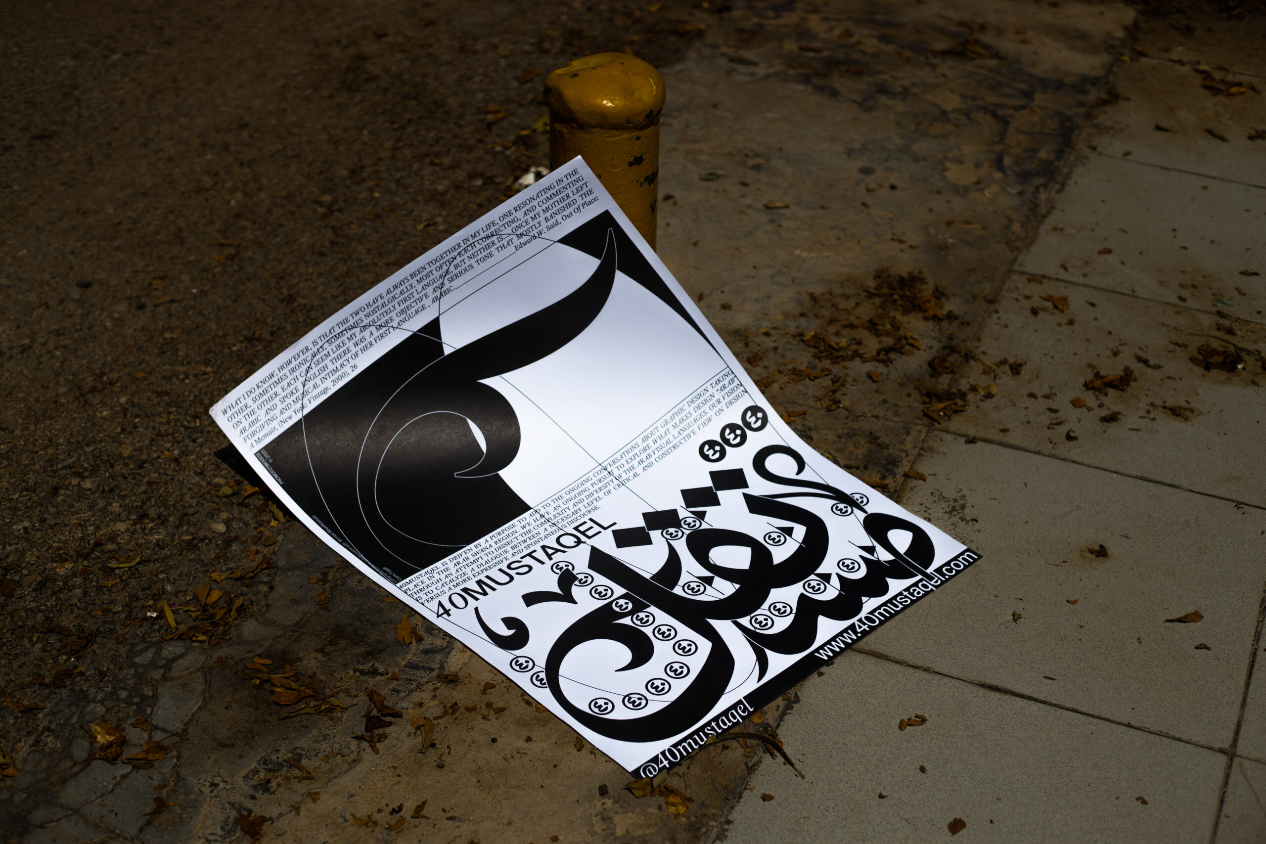
Among the studios grappling with these questions most directly is Cairo-based design and publishing practice 40Mustaqel. Founded in 2021 by Nada Hesham, the studio has quickly established itself as one of the region’s most forward (and “backward”) thinking voices, utilising design as a service discipline but as a tool for research and cultural inquiry. Through projects such as Palestine From Above, which examined the relationship between colonial aerial imaging and the visual construction of Palestine, and Isdar Mustaqel, an experimental publishing platform exploring the histories and futures of Arabic visual culture. In the process, the studio has pushed for a historically-rooted, forward-thinking aesthetic, approaching Arab design with a rare academic and political rigour.
For creative director Mina Maurice, the question of what makes a design “Arab” has little to do with visual motifs. As he puts it, “the question of Arab was always a question of a shared experience and not a visual playbook.”
Discussing Islamic manuscripts, Maurice stresses their historic importance as systems of collaboration. These artefacts were produced through the work of scribes, calligraphers, scholars, and artisans whose interventions accumulated across generations and geographies. The manuscript is a living collaborative system, continuously revised, expanded, and reinterpreted. “It is like a conversation basically frozen on paper,” he explains. “[The manuscript is not important] just because of how it looked. It was smart because of how it came about.”
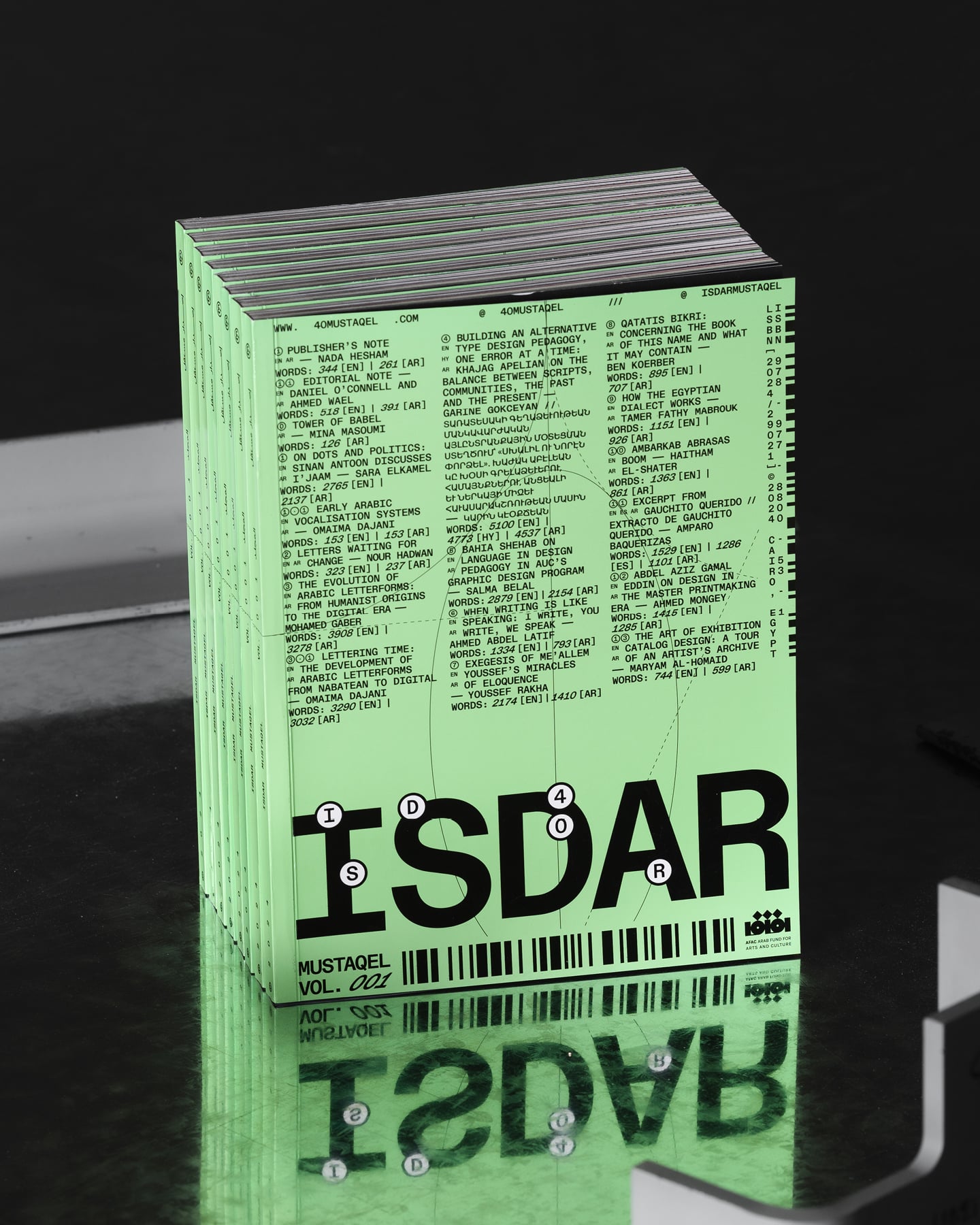
Maurice is equally wary of romanticising this fact. The same networked environment that has expanded access to these visual histories and references has also produced a dull visual homogeneity. Designers today have access to an effectively infinite archive, and trends circulate faster than ever. “You open Instagram and see a lot of these posts that all start to look the same,” he tells me. “[We] should look a little deeper.”
Fortunately, some of the most compelling designers working today are attempting to escape this complex of pacified reference saturation. This spirit is clearly embodied by the likes of Palestinian visual artist Mohammed Tatour. Through his practice and design studio MOONI Studio, Tatour has become one of the most influential image-makers of his generation, shaping visual identities for landmark cultural institutions and platforms such as Ma3azef and BLTNM while developing a visual language that has, ironically, become referential in the field.
His ability to break from the mould is possibly because his references are rarely confined. During our conversation, he revealed the backend of his visual universe: PLO resistance posters, Islamic architecture, Andalusian history, school textbooks, Tumblr dashboards, obscure Urdu websites, Japanese Islamic graphics, early internet interfaces, street billboards, ceramics, calligraphy, and whatever else happened to be open in his browser tabs that day. “Every designer wants to capture 2026,” he tells me. “I’m going backwards.” At the surface level, that sentiment sounds nostalgic; however, it is anything but.
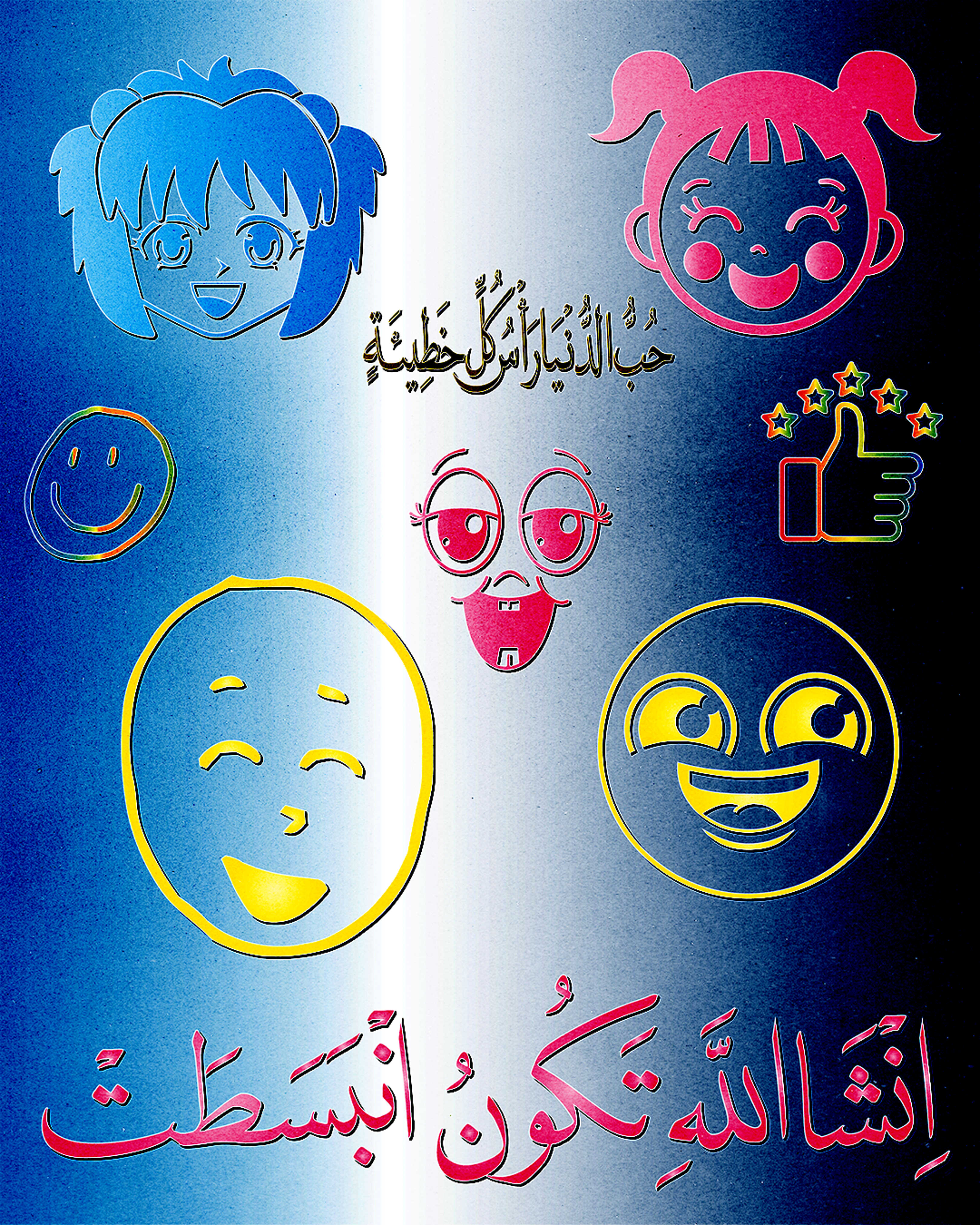
Tatour is a student of excavation, mining visual histories that already exist, and forcing them into coexistence, harmony at best. The result is work that often feels jarringly temporally undefined. Looking at one of his images, it is directly obvious whether one is encountering something archival or something entirely new. An ambiguity that Tatour loves to cultivate. “It should feel futuristic, but also like it reminds you of something you’ve already seen,” he explains. “If you only understand TikTok and Tumblr aesthetics, then I’ll use TikTok and Tumblr to take you back to eighties PLO posters.” Design as a smuggling device of visual histories, thrown into the current abysmal attention economies through familiar reference. It’s a formula that works well.
“If you only understand TikTok and Tumblr aesthetics, then I’ll use TikTok and Tumblr to take you back to eighties PLO posters.”
Tatour’s archival ventures also carry a personal, uniquely Palestinian urgency. Throughout our conversation, Tatour repeatedly returned to the question of preservation. “They keep us without archives,” he says. “So we make sure there are archives.” The archive for Tatour is not a repository of dead images. History survives through continual reuse and reinterpretation, whether through design or otherwise. The image at hand here, when approached with care, becomes a carrier of multiple histories at once, and not an aesthetic detached from its origins.
History and preservation are only one thread running through this generation of image-makers. For Amman-based designer Hescham Alkarshan, his interests are more fundamental: the relationship between the Arabic letter and the emotional life of the Arabic language. For the young designer, contemporary graphic design, even in its more alternative forms, has increasingly drifted toward commercial utility, sacrificing much of the sensitivity that once has historically distinguished the Arab visual language. “The script itself serves as a message and serves as an element of beauty,” he tells me. “We’re losing the sense of humour, the sense of comedy… the feelings and emotions [design is supposed to convey].”
Throughout our conversation, Alkarshan repeatedly returned to the idea that Arabic calligraphy can’t be understood purely as form. “You can’t talk about Arabic calligraphy without talking about language,” he argues. “They’re inseparable.” The beauty of the Arabic letter, in his view, is surely in its decorative potential but also in its emotionality and poetics naturally embedded within the language. “Appreciation for the letter has to come from appreciation for the language,” he says.
“You can’t build appreciation for the letterform without appreciation for the language and all its beauty and feelings. The letter is knowledge and knowledge is worship.”
In a design landscape that has long moved beyond questions of Arabic’s functionality, Alkarshan’s concern feels particularly timely, especially at a moment when many practitioners seem enamoured with the language for its aesthetic value alone. The Arabic letter has undoubtedly been made to look contemporary through years of Blender experiments, 3D renders, and other aesthetic experiments capable of appealing to a gawking “global audience”. But preserving the emotional charge that has historically made the script so powerful is a challenge of a different calibre entirely. His work fundamentally returns the Arabic letter to its original condition as a sacred image and language.
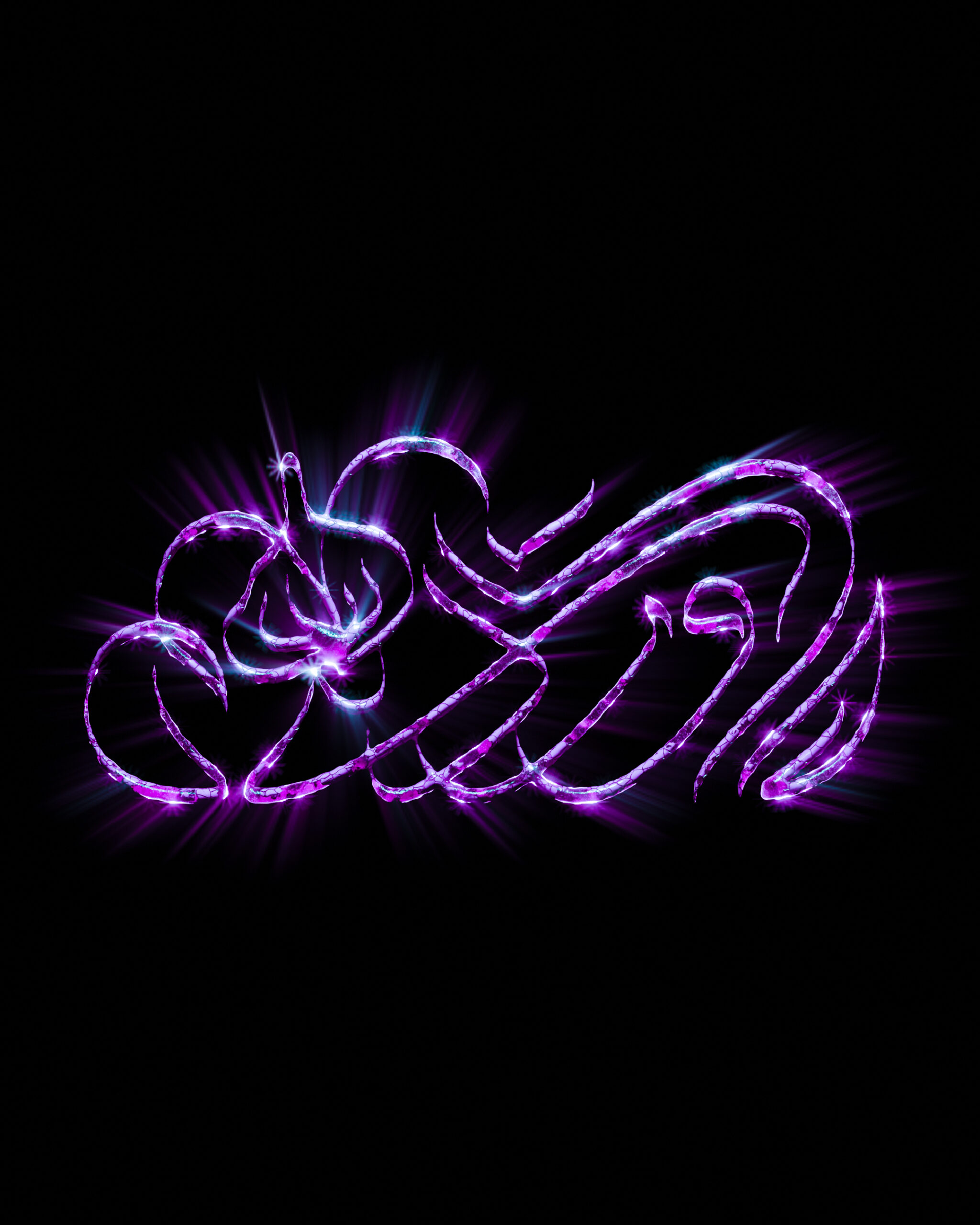
Recent projects, such as his ongoing Warda (flower) series, revolve around a single Arabic word repeated and reimagined through dozens of visual interpretations. Inspired as much by Iraqi pop songs and personal memory as by classical calligraphy, each iteration attempts to capture a different emotional register for the same emotionally-charged word. The exercise is stubbornly simple in its premise. Alkarshan is ultimately interested in how much meaning can still be distilled from the language’s aura.
His thinking is rooted in the belief that visibility alone is a fickle guarantee for innovation. Among the practitioners who understand that sensibility is Amman-based designer and artist Mothanna Hussein. Together with longtime collaborator Saeed Abu-Jaber, Hussein co-founded Turbo, one of the most influential design studios to emerge from the creative fringes of the region over the past decade. Since its founding in 2015, the studio has produced landmark work. Chances are that if you’ve spent any meaningful time following the region’s independent cultural scene over the past decade, you’ve already encountered their work.
For Hussein, the contemporary visual landscape is tainted by an unprecedented abundance of references that feed into the designer’s eye. “The internet is good and bad,” he explains. “You start getting affected negatively by it when you fall into following a certain trend while seeing what everyone is doing… suddenly you’re not making something new.” In an era increasingly marked by generative AI, Hussein disdains the repetition that it has brought about in its wake. “You see people watch something become a trend, trying to understand how it was made, then repeating the same thing,” alluding to a mindless design process.
That process is anything but absent from contemporary experiments with Arabic typography. While the Arabic letter has become one of the most productive venues of visual innovation over the past decade, Hussein is wary of the way it can easily be reduced to ornament.
“Sometimes I don’t want to decorate something with Arabic just so the audience likes it,” he explains. “You don’t get the reach unless you infuse that Arabic type fetish that foreigners love.” The observation is shared by many of the designers mentioned here. But it is crucial to note that this attitude is not a rejection of calligraphy, but a firm reminder of its complexity. As Hussein puts it, understanding Arabic design requires more than appreciating the shape of the letters. “You have to know the language. Not just how it looks, but why the word moved the way it does.”
Hussein and his collaborators at Turbo frequently work alongside calligrapher Hassan Kanaan. The relationship is occasionally tense, often generational, but deeply productive. “Most of our work, ninety per cent of it, is collaboration with a calligrapher,” Hussein explains. The result is an artistic push-and-pull. Hussein recalls proposing alterations that initially shocked Kanaan, who would sometimes view them as a defence of the letter. But the friction is what gives way to new possibilities.
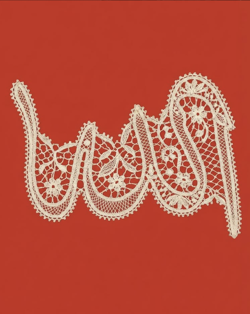
Hussein’s ongoing Allah series puts said friction on display. Produced mostly through 3D modelling, the project treats a sacred word as an image and an entire visual system. “I didn’t come to the project from calligraphy,” Hussein explains. “I came to it from wanting the word to have more dimensions.” It is essentially an ongoing act of translation. Drawn to a word he encountered everywhere, from homes and walls to the broader visual culture surrounding him, Hussein began pulling it apart and rebuilding it across different mediums. The result is a dazzling universe of sculpture, jewellery, textiles, print, digital imagery, and public interventions. How many lives can the single most recognised word in Islam live while remaining immediately recognisable? Many.
For all the discourse surrounding visual stagnation and reference fatigue, and the endless stream of lookalike aesthetics and Arabic chrome fetishism, there is a generation of practitioners still insisting on punching forward to produce imagery and design rooted in but not entrapped by tradition on one end and trends on the other.
Today, entire visual worlds can be downloaded, replicated, and, for better or worse, AI-generated in no time. The concern of accessibility is no longer the issue it used to be. That battle has largely been won. The more daunting but exciting task is determining what exactly should be done with that freedom, and if any of it is worth our time.
And none of this is any advocacy for any flimsy genre of futurism. Not out of a defence of nostalgia, nor as an exercise in preservation for its own sake, but as a way of breathing new life into a visual culture that has endured for centuries. The work ahead is not solely artistic development, although that remains part of it. It is a deeper engagement with the language itself.
The Arab image continues to move. So do the people making it.


